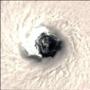


The first one is from 324 hours and shows an insane low pressure system that is 972 mb if I read that right taking up a good portion of mainland North America. Would this be like the Storm of the Century II or something else? I don't see any other pressure systems around it and I wonder if the lower resolution on the model just makes it like that. The 2nd image (336 hours) shows it moving east and bringing southern Ontario a good whipping...is this just rain or maybe something significant? The trough did look very large.
While on the topic of GFS model imagery, I want to improve on temperatures within the model guidance. What exactly (with regards to temperature) are those blue and red contours showing? I see increments of 10ºC for each line but I doubt they are totally surface based. Does this take into account anything like soundings and mixing?