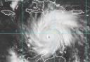
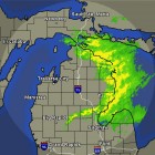
It's been mentioned before, but in case you never found your way to this part of the NOAA site, they did an outstanding job with the graphical forecast map interaction. Click on a region (for instance SE LA), and all you have to do is drag your mouse over what graphic you want it to show. Not to be political or anything, but it's no wonder some of those companies are out to control dispensing the data. The gov't's doing it better and without the advertising and popups.
 http://weather.gov/forecasts/graphical/sectors/
^^^^^^
A link you'll want to bookmark if you don't already have it.
Steve